Introduction to Data Visualisation
Human and visualisation have been together since the dawn of mankind. When writing as a skill was not developed the form of communication was through pictures and carvings on the wall and stones. Since then till date visualisation still remains a powerful mode of communication.
The way a human brain processes information through visualisation: charts graphs and dashboards
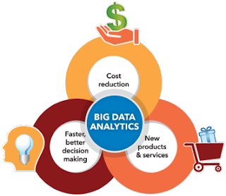
 compared to raw and tabular data is much more efficient. A lot can be said through a single graph or chart which an entire data set can't. With the advent of Big Data technology the cost of maintaining the data has become cheaper which allows the organisations to hold humongous amount of data without any thought of cost of maintenance. However we need to put this data to work for us rather than we simply working to maintain it. The beauty lies in unwrapping the hidden patterns and mining the information from it. Though tabular report remains one of the data visualisation form, however in most cases its not and here as an data visualisation professional one needs to distinguish between the purpose and the type to be chosen for visualisation. It works good in case of with a limited or few set of rows, for example building a crosstab, heatmap and so on.
A good visualisation can comprehend a complete story in a frame and highlight the KPI's for business. This helps business make right decisions at right time. This is an age of information and data is its ingredient. For any successful running organisation its necessary to process, maintain and present the data to provide business insights.
The way a human brain processes information through visualisation: charts graphs and dashboards

A good visualisation can comprehend a complete story in a frame and highlight the KPI's for business. This helps business make right decisions at right time. This is an age of information and data is its ingredient. For any successful running organisation its necessary to process, maintain and present the data to provide business insights.
A right decision can help you save millions and a wrong one can cost you you're business.

Good piece of info.
ReplyDeleteGood job done. Shahnawaz.